27 June 2016

New Allen Field Office

New Allen Field Office

Allen Field Innovative Design and Manufacturing uses variety of materials, textures, and colors to enliven their new corporate office on Long Island.  The renovation of this small office building in the suburbs of New York City gives Allen Field a new home that better represents its corporate vision while providing a comfortable work environment.  A nondescript office and warehouse in Brightwaters, NY was transformed into the new corporate office with a simple plan, new windows, glass garage doors, interior finishes and furniture.

A new centralized airlock entry provides a formal entrance to both Allen Field and its prototyping partner.  A large glass wall, with an obscured view into the meeting room beyond, greets visitors and is accessible to both offices it divides.  By providing a multi-use space, to be shared between offices, each office is allowed greater area for daily activities.  The glass walls not only announce entry but allows the meeting room to seal some daylight from the south entry and provide a counter to signage within the foyer.

Glass Enclosed Conference Room Adjacent to Entry, (Obscured glass & signage added since photo was taken.)

Private offices line the buildings south side while additional interior glazing allows daylight to penetrate into the large open office area beyond.  Windows to the west provide additional light as does a large glass roll-up garage door to the north.  The north side of the building also includes bathrooms, an open shipping area, that also allows light into the open office, and the kitchen and employee lounge.

The large glass garage door at the kitchen and employee lounge help to bring in the outside by allowing even north daylight to flood into the space while offering an opportunity for employees to connect to the outside.  This door opens onto a small landscaped area, abutting a residential property, allowing employees to literally open up the office to the outside, providing fresh air and the opportunity to dine al fresco or even catch a glimpse of nature while working.  This space also provides outdoor space for events hosted at the office, effectively enlarging usable space for clients and guests.

Glass Garage Door at Employee Lounge


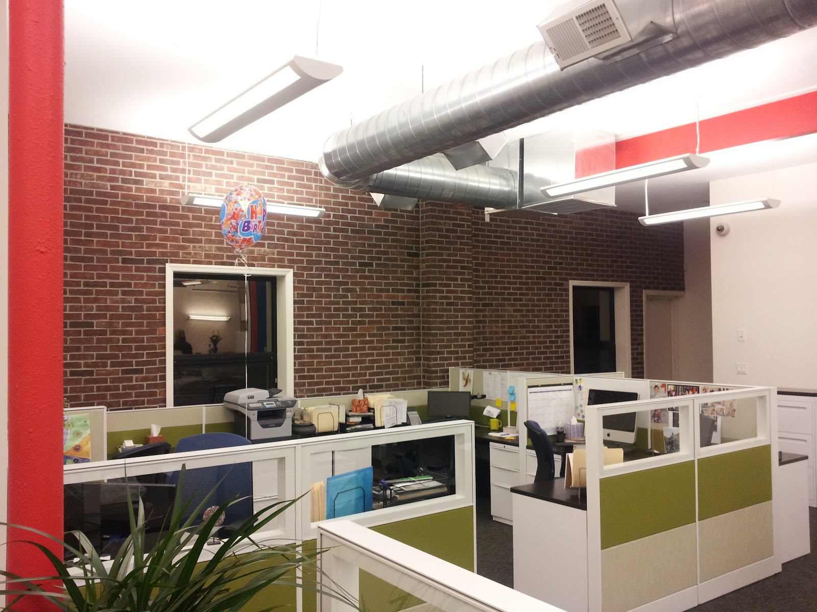
Inside, color and material variation add visual interest and highlight features of the building.  The existing steel structure is highlighted with bright red paint not only to showcase the buildings structure but also to highlight the work floor and the circulation zones around it.  Visually bringing you around the space the structure boldly states its presence.  On the west, exterior, wall, a brick veneer relates to the existing masonry construction and provides a texture to the space in contrast to the gypsum board ceilings and walls.  A bright blue, the Allen Field corporate color, saturates the spaces opposite, east, wall and leads into the shared conference / meeting room, rounding out the space.

New mechanical systems even get a chance to make an elegant yet bold statement with overhead exposed spiral-duct and reflects off of indirect pendant fixtures hanging below.  Brightly finished ceiling and walls provide ample light throughout the space while minimizing the number of fixtures required.

The bold use of color is apparent within the space and adds dimension and interest to this relatively small corporate office.  With daylight, texture and color a previously dreary warehouse has been transformed into an exciting modern work space.


Office Interior


19 August 2015

An Architects Alphabet - Interview on Blueprint


I was recently interviewed about A is for Architecture, my Architecture children's book.  You can read the entire interview here to get a behind the scenes look at what went into the book.

http://h2mblog.com/2015/07/01/an-architects-alphabet/ 

"A is for Architecture" is currently available at lulu.com and amazon.com.

Thanks for reading,

10 April 2014

A is for Architecture on Exhibit


This month, "A is for Architecture", my recently published architectural children's book, will be on exhibit at the American Institute of Architects Headquarters in Washington DC,  as a part of the 2014 AIA Emerging Professionals Annual Exhibition.  For the exhibition, which is on view until April 30, 2014, the book was transformed into a poster where all twenty-six hand drawn illustrations each of which is accompanied by an architectural term, are displayed as a single sheet taking the viewer through the alphabet in a fun read that is pleasant and instructive.  I do hope this will be a fun place to stop among the 50 plus other projects that are part of the exhibition, the majority of which, understandably, are building projects.  

It is an unfortunate fact that many Americans receive no architectural instruction, are unaware of even the most notable architects, and often times, while they may appreciate specific buildings, don't find value in the profession.  Architecture is a part of our everyday lives, it is where we work, live, and play.  Therefore, it is important that we are all aware of the environment around us, both natural and built, as well as the people that help shape that environment and design the places we enjoy.

"A is for Architecture" was written, illustrated, and published to offer a way for parents, architects or otherwise, to introduce their children to architecture and start the conversation on being aware of, and having an appreciation for, the built environment.  Although written as a children's book, it is suitable for those of any age.  While readers are sure to recognize many of the buildings included, some lesser known, but still important, buildings and architects are featured.  The hope is that each drawing may peek an interest in architecture and invite the reader to explore further.  Teaching children about architecture in a fun and interactive way increases their awareness, interest, and, hopefully, participation.  This can only benefit the profession, the built environment, and society. 

"A is for architecture is available online at lulu.com and amazon.com

Visit the exhibition site here.


31 October 2013

Architecture in Tension

Start of the show with low hung fixtures focused on each band member

Earlier this month I had the pleasure of seeing one of my favorite bands, Nine Inch Nails, live during there current Tension 2013 tour.  It has become somewhat of a tradition.  The band comes around and we start planning which shows we'll be attending.  This year we made it to four, Boston, MA; Brooklyn, NY; Newark, NJ; and Washington, DC.  The shows were great, a combination of classic NIN tunes with quite a few tracks from the bands new album, Hesitation Marks.  The shows are intense; picture this, one of the best bands you've ever seen live are about to take the stage, a black curtain, billowing from the smoke it's holding back, hides the stage, the lights go out, the crowd roars and surges forward, the curtain comes down and the smoke comes pouring out into the crowd, show time.  A few sparse lights light the stage and the first song starts, as the smoke starts to clear the band comes into view.

Wait, this is A for Architecture, this isn't going to be a review of the show, well not of how the show sounded, but of how it looked.  Being an architect I tend to look at things spatially, noticing how spaces are arranged, organized, related, and how they feel.  The stage set and lighting rigs used for the Tension 2013 tour are more akin to what one would see in a theatre show than a concert, not only the lighting and the atmosphere they help to create, but the physical fixtures themselves.  At the beginning of the show, with the curtain coming down and all that smoke, the band is lit with fairly large nine square grid light fixtures barely over the head of each musician.  The affect of the smoke, both on stage and surrounding the audience unites both, the low lights giving an intimate feel to the arena you're standing in.

Throughout the show the affect of these lights change going though a series of metamorphosis.  The low slung lights slowly raise and face the audience after the fist few songs, effectively enlarging the stage, creating more of a sense of an amphitheater, matching the scale of the space your in, an arena that fits over 15,000 people. This is more of what one would expect from a show in this type of venue, colored lights shining down on the band from high above. But this feeling too, only lasts a few songs.

As the lights rise the stage appears to grow. 

As the show continues, what appears to be a metal grate slowly lowers in front of the band, creating a physical barrier between the band and audience, one that is experienced by all.  At one point the lowering of this grate happens while Trent Reznor sings "I'm running out of places I can hide from this", seemingly answering his call of another place to hide.  This is a sharp contrast from the open amphitheater lighting that helped to unite the performers and fans putting the band in a different room of sorts.  After a single song the grate reveals itself to be a screen of LED lights that flatten out the visual of the performance, we see the band as if watching them on screen, a live music video.  This flattening quickly gives way to a 3D affect as the screen in front of the band combines with other screens between and behind them giving it the depth of looking into an old CRT computer monitor turned into a shadowbox.  At one point Rob Sheridan, the bands Art Director, comes out with a camera that projects abstracted images of band members onto the screens adding to the "we're watching the band on IMAX" affect.

Screens in front, amid, and behind the band give the appearance of watching the show on a large 3D monitor

The feeling of the stage show changes the dynamic between the band and crowd throughout the show, each song given a different, and specific atmosphere.  Closing the show is the bands seminal hit "Hurt" during which part of the band appears standing in front of the foremost screen bringing them visually closer to the audience, appropriate for this intimate closer.  Those familiar with the song know it grows, as does the stage, the screen separating the band slowly lifts revealing the band in its entirety, once again uniting stage with arena, as the song crescendo's and, the band exits the stage.  

Trent Reznor and Robin Finck in front of the screen near the end of the show.

Architects are constantly thinking of how to create dynamic spaces.  Attempts have been made with the use of elaborate forms or changing scale, think the Sydney Opera House or many buildings by Frank Gehry. More recently technology has made it possible to have architecture with actual moving parts, the Milwaukee Art Museum by Santiago Calatrava for example.  Likewise, bands have been putting on stage shows for as long as I have been seeing shows.  Typically lights and projection screens dominate the stage show with light levels, color, and focus creating an aura for each song.  Essentially this dynamism, movement, action, comes from how we perceive a space and not necessarily moving pieces.  We all experience architecture different than we do a performance; a performance is typically experienced from a single vantage point, while architecture is experienced as we move through and around it, continuously changing our perspective as the space reveals itself to us, should we choose to notice. Rarely have I seen the physical nature of a stage change as I have during these recent Nine Inch Nails shows, this dynamic architecture, architecture in tension if you will, that is a part of the Tension 2013 tour has added a dimension to the experience of a NIN show while adding to the conversation of what influences perception and how we experience space.

Thank you, goodnight! 

24 October 2013

LOT/EK's Ada Tolla: Objects + Operations


On Thursday October 17 I had the pleasure of seeing Ada Tolla, principal along with Giuseppe Lignano of the innovative New York and Napoli, Italy based architecture firm LOT/EK, speak at the Old Westbury, NY campus of the New York Institute of Technology (NYIT).  The talk, titled "O+O (Objects and Operations)" was, I imagine, a preview of the firms upcoming book of the same title, and focused on the firms innovative approach to architecture and materials.

LOT/EK is largely known for the work it does creating architecture with the ubiquitous shipping container, an object we are all, no doubt, familiar with but few of us associate with architecture.  However, starting in 1993, LOT/EK has stepped beyond the initially intended or the expected use of everyday objects, rethinking how things can be changed and used in unconventional ways.  This goes beyond the shipping container and includes objects both small (kitchen sinks, road cases, detergent packaging) and large (concrete mixers, water tanks, airplane fuselages).  To paraphrase Tolla during the lecture the LO in LOT/EK is noticing the inherent potential in everyday man-made objects, the TEK is the "incorporation, adoption, and corruption of the hidden systems" inherent in these everyday objects.  The Operation of LOT/EK is to transform these everyday Objects.

Throughout the presentation a barrage of images, within various given categories such as "Stack + Shift", "Tilt + Lean", and "Point + Hover", featuring items commonly found in an urban environment, were shown (lumber, packages, construction vehicles, manhole covers, etc.) accompanied by Tolla speaking of the objects, not specifically but both literally and theoretically; their material, their form, their intrinsic value, their impact, their beauty, their transformation.  Alternating with these bundles of images specific projects were discussed, ranging in size from a 30 square foot Theatre for One made of road cases and exhibited in Times Square among other places, through the 400,000 square foot Pier 57 mixed use project on the Hudson River currently under construction.  These projects, along with the others presented all share one thing in common; transforming existing, everyday objects into architecture.

I was first attracted to LOT/EK as a student working on the 2005 Solar Decathlon entry of NYIT, the same school this lecture took place. We had made a decision to include a shipping container in the design, I would be dishonest if I didn't point out LOT/EK's influence.  At that point my outlook to what architecture can be, as well as what can be architecture, changed.  I looked up books on LOT/EK, exploring their explorations and was fortunate enough to be able to visit the Mobile Dwelling Unit they had on display in the moat of the Whitney Museum of American Art.  As a student these ideas challenged my thought process and approach. What LOT/EK does is not a gimmick, while they are known for using shipping containers each project addresses a specific site and circumstance.  All designers work with a given set of materials, whether it's paint, fabric, lumber, or steel, LOT/EK has made the conscious decision to use materials of a notably larger scale.  LOT/EK takes an approach to design that strives to be "unoriginal, ugly, and cheap" while at the same time being "revolutionary, gorgeous, and completely luxurious."  They achieve this by considering a project within its context, both local and global.

After the presentation this past Thursday I spoke with Ada Tolla about how the use of these everyday, often discarded, objects represents a 21st century vernacular.  The objects LOT/EK uses are all around us and represent our time.  The shipping container speaks to our consumer culture, our worship of belongings, our insatiable appetite for everything, while the fact that they litter our ports highlights our wastefulness, our damage to the environment, and our disconnect from our community and culture.  Using these very objects addresses the issues we face, the changing environment, resource reduction, waste, social and cultural interaction.  Hopefully by changing these everyday objects into ones with different, more personal functions, the collective awareness of our surroundings and the impacts of our decisions will improve and help create a better world.

I will end with something Ada Tolla said during her presentation that stood out, and I expect will stick with me:  "to use something is to hack it, by changing something is to make it more truly itself...to circle around something is to avoid it, to put a circle around something is to face it."

Theatre for One
Pier 57
Whitney Studio

Version of the lecture given at MIT

17 October 2013

Aga Kahn Award for Architecture Goes to Rabat-Salé Urban Infrastructure Project

Hassan II Bridge
This past September the winners of the Aga Kahn Award for Architecture were announced.  Started in 1977 the Aga Kahn Award for Architecture is presented every three years to projects that successfully address the needs and aspirations of Islamic societies.  Unlike other architecture awards, such as the Pritzker Prize, the award is given projects that demonstrate excellence and not an individual.  Among this years winners was the Rabat-Salé Urban Infrastructure Project in Rabat, Morocco.  

Upon first glance the project appears to be no more that a simple bridge.  It is in fact a bridge, the Hassan II Bridge, but it is not simple, it contains multiple levels accommodating a tramway, motor vehicle, and pedestrian traffic.  While one could point out the elegant curves of the subtly varying arches that make up the bridges structure the real reason to admire the project is its function.  Not only does the bridge unite the neighboring cities of Rabat and Salé it also provides an urban roof over a public space that will contain markets and leisure activities thus not only providing a connection between the cities but offering opportunities for social and economic growth.  Additionally the scale of the Hassan II Bridge relates to the overwhelming horizontality of the surrounding built and natural environments, respecting its context.  This seemingly simple infrastructure project addresses the transportation needs of the two cities while respecting their scale and providing space for their inhabitants, truly considering its full impact. 

The Aga Kahn jury noted the Hassan II Bridge "anticipates a long term vision of the cities of Rabat and Salé...provid[ing] opportunities for future development [it] successfully combines a bridge with urban planning, landscape and infrastructure improvements."  This should be a note to other architectural awards that while "form follows function" it is the function that should be truly celebrated. 

For more details on the project, as well as the other winners of this years Aga Kahn Award for Architecture, visit the awards official website at www.akdn.org/architecture


03 October 2013

New Certified LEED Home


Hampton Bays, NY is home of one of the most recently certified green homes on Long Island.  Certified at the Silver level of USGBC's LEED for Homes rating system the nearly 7000 square foot, 6 bedroom home achieved a lot for a home of its size.  In addition to achieving LEED for Homes certification the home is one of very few here on Long Island to successfully achieve both Energy Star Version 3 certification and Energy Star with Indoor Air Package.  

Driven by a client who is sensitive to indoor air pollution one of the driving factors during the design and construction was to provide and maintain superior indoor air quality.  This was achieved using high efficiency, right sized, equipment within the tight building envelope.  One of the first steps to increasing the indoor air quality was to minimize the amount of toxins within the home.  This is accomplished with the exclusive use of  zero and low VOC paints and adhesives throughout the house.  Additionally, a mud room adjacent to the attached garage, with a shoe changing and storage area help to minimize the amount of pollutants brought into the house while advanced air filtration, as a part of the homes ventilation system, help to remove contaminants that do make it inside. 

Not only does the high efficiency HVAC help to achieve high indoor environmental quality by keeping impurities to a minimum but it also helps to maximize comfort along with energy efficiency.  A wood framed building envelope with flash and batt insulation, a method that includes a shallow layer of spray foam insulation that provides a complete air barrier along with typical batt insulation, provides a tight envelope that minimizes air infiltration and eliminates drafts.  This tight envelope allows the HVAC to efficiently provide conditioned air to heat or cool the space as needed.  The project received a Home Energy Efficiency Score (HERS) of 96 helping it achieve a total of 32 of a possible 38 points in the Energy and Atmosphere credit category.


In addition to great energy efficiency and indoor air quality the project gained LEED for Homes points with a largely native landscape plan that requires less maintenance than typical Long Island yards, a high efficiency irrigation system and low flow plumbing fixtures, and a variety of environmentally preferable products including bamboo floors and FSC certified cabinets. 

While there was a steep learning curve for much of the project team, this being an introduction to LEED for Homes for many of them the project succeeded with continued perseverance and determination.  In hindsight I would recommend including the Integrated Project Team approach, especially where those new to LEED are on the project team, in order to open and maintain communication throughout design and construction.